
Tips for Choosing Calm Colors for Your Home
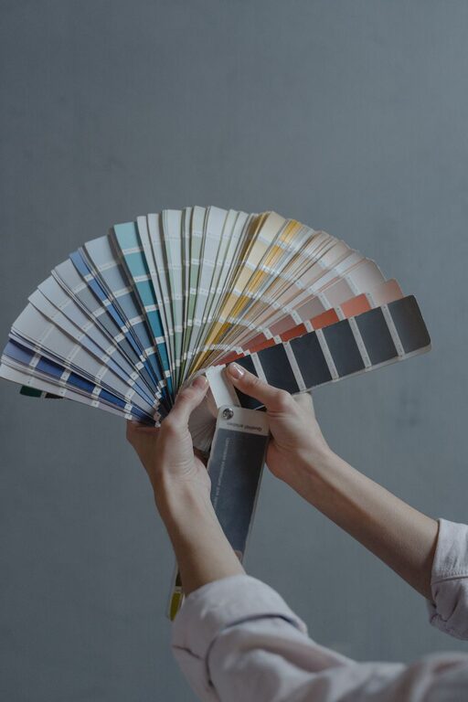
Creating a peaceful and calming environment in your home often starts with the colors you choose for your walls, furniture, and accessories. Calm colors can help reduce stress, promote relaxation, and make any space feel more welcoming. But with so many colors and shades available, how do you pick the right ones? This guide offers practical tips to help you choose calm colors that suit your taste and make your home truly restful.
Why Choose Calm Colors?
Calm colors are typically soft, muted, and easy on the eyes. They can:
– Lower anxiety levels by providing a soothing backdrop.
– Make rooms feel more spacious and airy.
– Encourage restful activities like reading or sleeping.
– Complement various styles and décor without overwhelming the space.
Common calm color families include blues, greens, neutrals, and soft pastels. Each has unique qualities that can influence the mood of a room.
Understanding Color Psychology
Before selecting colors, it’s helpful to understand how colors affect emotions:
– Blue: Often associated with tranquility and stability. It’s great for bedrooms and bathrooms.
– Green: Symbolizes nature and balance. Ideal for living rooms or spaces where you want to feel refreshed.
– Neutrals (beige, gray, taupe): Provide a subtle backdrop that promotes calmness and flexibility.
– Soft pastels (lavender, blush, pale yellow): Can add gentle warmth and light without overwhelming senses.
Knowing these basics helps you choose colors that align with the atmosphere you want to create.
Tips for Choosing Calm Colors
1. Consider the Room’s Purpose
Think about how you’ll use each room:
– Bedroom: Choose colors that encourage rest, such as soft blues or gentle greens.
– Living room: Opt for warm neutrals or muted colors that invite conversation and relaxation.
– Kitchen: Light colors with a touch of warmth can promote energy without being too stimulating.
– Bathroom: Cool tones like seafoam green or light gray work well for a refreshing vibe.
Matching color choices with room function enhances comfort.
2. Start with Neutrals as a Base
Using neutral colors for walls or large pieces of furniture creates a calm foundation. Neutrals allow you to introduce soothing accent colors through decor like pillows, rugs, or art, which can be changed easily if your tastes evolve.
3. Choose Soft, Muted Shades
Avoid overly bright or saturated colors, as they can feel aggressive or too stimulating for a calming space. Look for colors with lower chroma—this means they are less intense and more restful on the eyes.
4. Test Colors in Different Lighting
Lighting dramatically affects how colors appear:
– Natural light: Colors often look truer but can shift throughout the day.
– Artificial light: Warm bulbs can make colors appear cozier, while cool bulbs may brighten them.
Paint samples on your walls and observe them at various times before committing.
5. Use Monochromatic Color Schemes
Choosing different shades of the same color creates harmony and simplicity, making a room feel cohesive and peaceful. For example, pairing pale blue walls with navy cushions and sky-blue curtains.
6. Introduce Nature-Inspired Elements
Colors found in nature, like soft greens, sandy beiges, or sky blues, naturally evoke calmness. Compliment these tones with natural materials such as wood, stone, or plants.
7. Balance Color with Texture
Sometimes a color can feel flat or dull on its own. Adding texture through fabrics, rugs, or wall finishes can create interest without disrupting the calm atmosphere.
Practical Steps to Implement Calm Colors
– Make a mood board: Collect paint chips, fabric samples, and photos to visualize your color story.
– Limit your palette: Choose 2-3 main colors and 1-2 accent colors to keep the space cohesive.
– Coordinate with existing pieces: Consider furniture, flooring, and large decor items to ensure colors blend well.
– Use color psychology online tools: Many websites offer suggestions based on mood and color preferences.
– Paint a small test area: Live with it for a few days to see how it feels.
Common Mistakes to Avoid
– Choosing colors based solely on trends rather than your personal comfort.
– Relying on paint samples under store lights rather than in the actual room.
– Overloading a calm color palette with too many contrasting accents.
– Ignoring the effect of color undertones (cool vs. warm shades).
Final Thoughts
Choosing calm colors is a wonderful way to create a sanctuary in your home. By understanding how colors influence mood and carefully selecting soft, muted shades that complement your space and lifestyle, you can design rooms that soothe and refresh you every day. Remember, the best calm color is one that makes you feel at ease and happy in your own home. Happy decorating!